Split: Grumpypoo's Transmission Thread -- Color Perception

Yamaha FJR Motorcycle Forum

Help Support Yamaha FJR Motorcycle Forum:

This site may earn a commission from merchant affiliate links, including eBay, Amazon, and others.

ionbeam

2 FUN
Joined
Jun 24, 2005
Messages
8,817
Reaction score
1,783
Location
Sandown, NH
Some of the pictures in Grumpypoo's thread were anointed with text and arrows using a color selection that some people couldn't see due to color blindness. The color imparerd asked people to use better contrasting colors when marking up pictures.

Men tend to be color blind significantly more frequently than women (look at the way some of us dress
wink.png
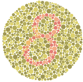
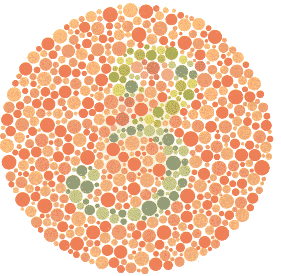
). People can be color blind in one or more colors. A standard test for color blindness are the Ishihara Color Blindness plates. Here are a few samples, can you see the numbers in the plates? The bubbles are done in different colors to isolate specific colors and tones that a person may have blindness to.

Plate2.gif
Plate5.gif
plate%202%2042.jpg


So, when we add text and arrows the first choice should be black and white followed by yellow.

People with color blindness typically have problems with red, green and blue due to issues with the rods and cones in the eyes which are responsible for color vision. My father was so color blind that my mother used to have to pack his suit case with this clothing in groups because he couldn't dress himself appropriately.

These days they are starting to make color blindness glasses which can help about 20% - 30% of people with this problem.

See, this is why you buy a FJR, it comes in sliver, gray, black and blue which looks gray, and red which looks gray
smile.png
And, we mark up our pictures with invisible text and arrows.

 
Last edited by a moderator:
Some of the pictures in Grumpypoo's thread were anointed with text and arrows using a color selection that some people couldn't see due to color blindness. The color imparerd asked people to use better contrasting colors when marking up pictures.
Men tend to be color blind significantly more frequently than women (look at the way some of us dress ;) ). People can be color blind in one or more colors. A standard test for color blindness are the https://www.colour-blindness.com/colour-blindness-tests/ishihara-colour-test-plates/]Ishihara Color Blindness plates[/url]. Here are a few samples, can you see the numbers in the plates? The bubbles are done in different colors to isolate specific colors and tones that a person may have blindness to.

[img=[URL="https://www.colour-blindness.com/CBTests/ishihara/Plate2.gif%5D"][/URL]https://www.colour-blindness.com/CBTests/ishihara/Plate2.gif][img=[URL="https://www.colour-blindness.com/CBTests/ishihara/Plate5.gif%5D%5Bimg=https://colorvisiontesting.com/images/plate%202%2042.jpg%5D"]https://www.colour-blindness.com/CBTests/ishihara/Plate5.gif]
plate%202%2042.jpg
[/URL]

So, when we add text and arrows the first choice should be black and white followed by yellow.

People with color blindness typically have problems with red, green and blue due to issues with the rods and cones in the eyes which are responsible for color vision. My father was so color blind that my mother used to have to pack his suit case with this clothing in groups because he couldn't dress himself appropriately.

These days they are starting to make color blindness glasses which can help about 20% - 30% of people with this problem.

See, this is why you buy a FJR, it comes in sliver, gray, black and blue which looks gray, and red which looks gray :) And, we mark up our pictures with invisible text and arrows.
There are numbers in the circles?
 
Last edited by a moderator:
Many years ago a color blind friend, by mistake, bought a carton of Marlboro menthols instead of the regulars. Couldn't tell the difference between the red carton and the green one.

 
I can barely see a 3 in the first. My parents knew I was color blind since kindergarten. They didn't tell me until later. A teacher scolded me for not doing the assignment right (color a picture of my front yard). The grass, tree trunk, and leaves were all brown.

When I went to work at an AFB, they in-processed me with a lot of hearing and vision tests. There was a binder with dozens of cards like those in the OP. I saw the first one then it was, "Nope, nope, nope, nope..." through the rest of them. They guy giving the test had a strange look on his face when we were done. The flip side was the hearing test. The punch card with the graph printed on it was mostly off the top of the chart. We had those every year or so because of the industrial noise that most jobs there exposed everyone to. By the time of my exit physical, I knew I'd lost some hearing. The exit test show "normal"... which meant it was down to the middle of the scale (a loss from my perspective).

HEY KIDS, EAR PLUGS WHEN RIDING, MOWING, AND SHOOTING.

It wasn't until the last few years that I learned there were different kinds of red/green color blindness. I knew there was a complete (monochrome) version as well as one that affects blues.

https://www.colourblindawareness.org/colour-blindness/types-of-colour-blindness/

Going on "leaf peeping" rides with my GWRRA chapter left me listening to the CB for exclamations of "OOs and AHs" so I would have cues where to look. The stark yellow leaves were the ones I could see. I have Deuteranopes. But, even though it lists the problem with red/black for the other type of red/green, I still see red text on black (or vice versa) as invisible ink. In some cases I can see that there IS text there but can't read it. As a sometimes software developer and often an application tester, I spent a lot of time asking that they break from the black/green/red (or green/yellow/red) tradition of coloring texts for statuses. For me that meant, black/black/yellow or yellow/yellow/black. More often than not, it fell on deaf ears so when roll outs followed, I would have to then explain that any task dealing with board-displayed status would need to be done by someone else.

 
Last edited by a moderator:
" . . . I still see red text on black (or vice versa) as invisible ink. In some cases I can see that there IS text there but can't read it. As a sometimes software developer and often an application tester, I spent a lot of time asking that they break from the black/green/red (or green/yellow/red) tradition of coloring texts for statuses. For me that meant, black/black/yellow or yellow/yellow/black. More often than not, it fell on deaf ears so when roll outs followed, I would have to then explain that any task dealing with board-displayed status would need to be done by someone else."
Back in the '80's when word processing was just being introduced into the state offices, we had a system from Wang--absolutely primitive by later standards. Most screens were black with green print, but you could set it up for different colors. A lot of people preferred black or dark blue print on a cyan (light blue) background. Just to screw with my buddy, I set his background and print both black. Then we got to watch him try to figure out what was wrong with his computer. Your tax dollars at work!
laugh.png


Last edited by a moderator:
Top