Redfish Hunter
Gone Fishing
1.Style is always important. Don't be afraid to embrace your feminine side. Don't expect me to embrace it for you, that is just nasty.1) I really don't see how one dash is any more or less attractive than the others. You guys concerned with "style" sure seem to be in touch with your feminine sides, that's all I can say...
2) I do wish it had an ambient temp display specifically for when riding on days near freezing but wet, but from what I've heard you can't really believe the one on the 2nd gen anyway.
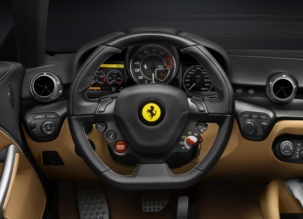
3)Now, here's a great functional looking dash:

2.The only time Dad's Gen2 temp is incorrect is when the bike has been parked. The temp rises inside the bodywork without airflow to carry away the heat. Dad's FJR ambient readout is always 2 degrees F cooler than the one on my ST. He loves to point out the temp reading on the signs in front of the small town banks when we are riding. They always agree with the FJR.
3. You call that functional? And you accuse us of being too in touch with our feminine sides. OOOHH, look at the pretty horsie in the steering wheel! He's dancing in the pretty yellow circle! How cuuuute! (I know, jealousy does not look good on me.)
Last edited by a moderator:


")